Enlightenment

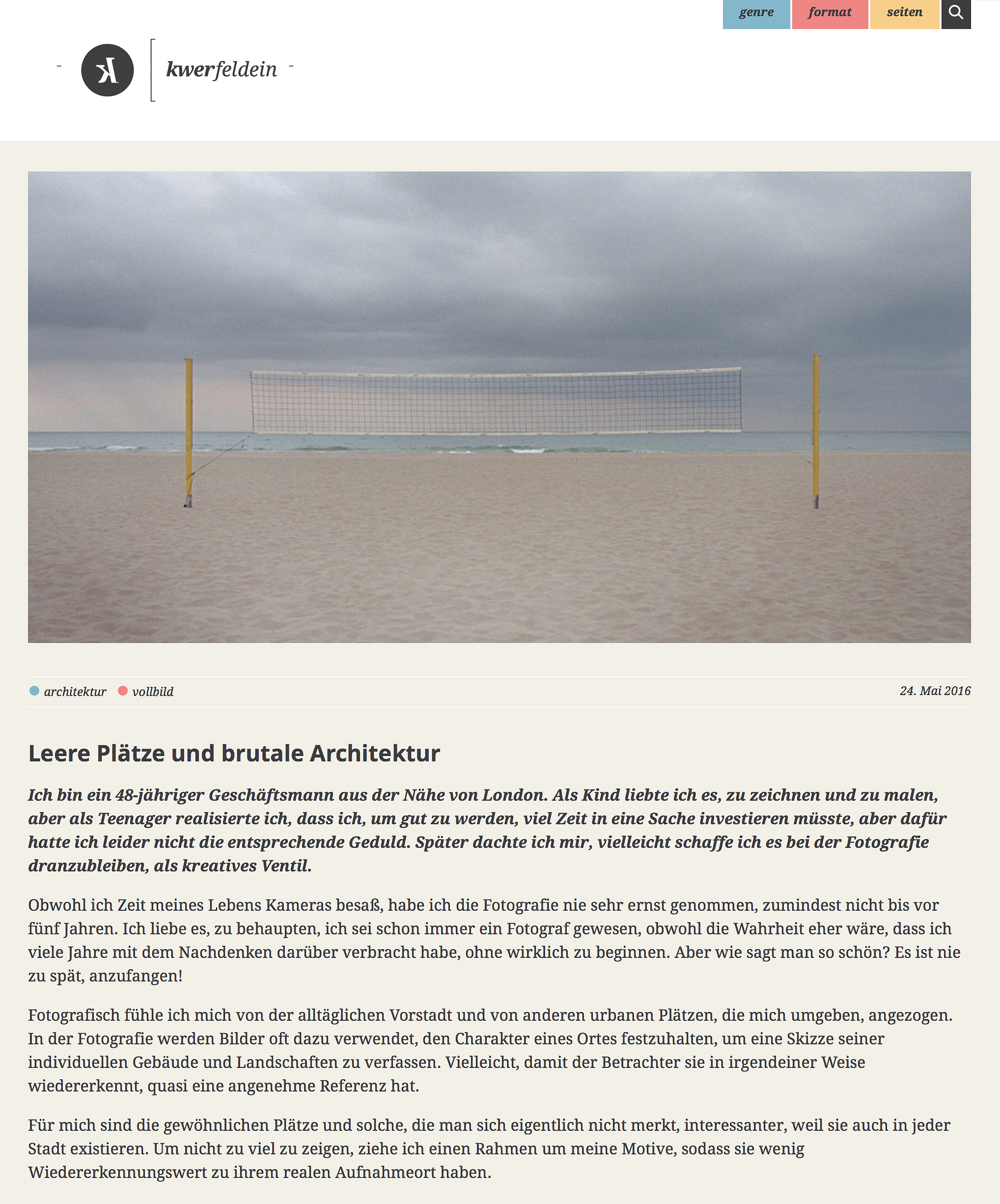
Emerging from the dark art of scanning


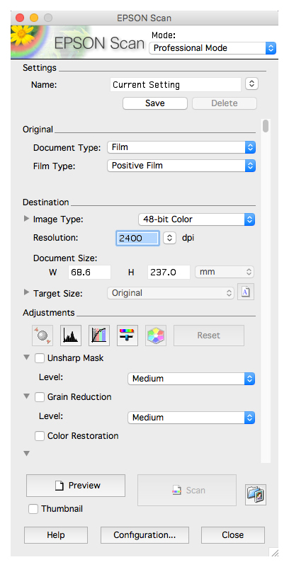
About a year ago I purchased CF Systems ColorPerfect plug-in,  I was looking for an effective scanning workflow that would allow me to skip my scanners bundled software EpsonScan.  I covered my thinking in a blog post entitled Perfect Colour here.   At that time I had concluded that colour negative scanning was a three stage process consisting of scanning with no adjustments, removal of the orange mask and inversion then finally colour correction. Almost from the off I had my doubts about ColorPerfect and over the months that I used the plug-in my doubts never abated.  During that time ColorPerfect regularly inverted negatives with odd colours that needed extensive correction.  Using ColorPerfect to make these corrections while entirely possible was with its difficult user interface never going to be a pleasurable experience and so once again I was using Photoshop to make extensive colour corrections.  ColorPerfect had become for me, simply an inversion tool and knowing that this is also possible with Photoshop I decided that some experimentation in the hope of simplification and consistency was overdue. 

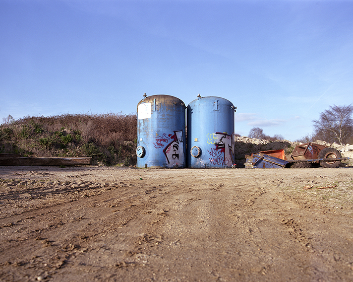
CF Systems ColorPerfect inversion of a linear scan from an Epson V500

Now after some months of experimentation and testing for the first time since I started scanning over four years ago I've finally arrived at a workflow that is for me, straightforward, consistent and most importantly satisfying.  In doing so I wanted to share my experience and method.  First task scanning the film with all scanner software controls set to off and include a decent slice of orange mask.  This produces a good linear scan of the negative with no automatic adjustments from the scanning software.

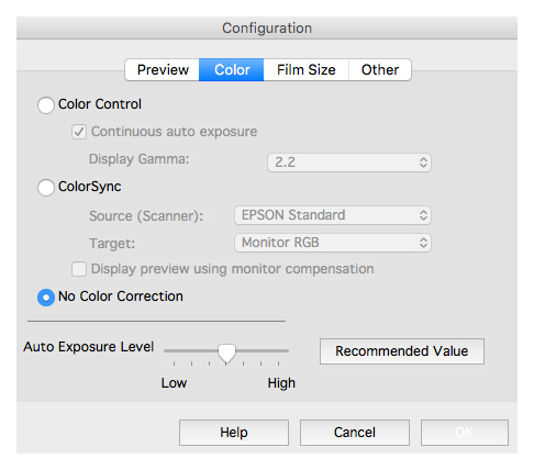
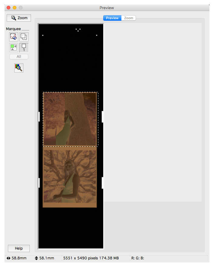
• Follow these setting on EpsonScan to make a linear scan


• Opening the linear scan in Photoshop it is first necessary to neutralise the orange mask.  

• Begin with a levels layer and sample the orange mask with the white eyedropper tool thus indicating the orange mask as white; it will become black when inverted, as will all the other unexposed areas in the negative.

• After sampling the orange mask with the white eyedropper tool all orange base areas become white and subsequently black when inverted. Note the white areas under the trees that will become the deep shadows.

• Flatten the two layers.

• Invert the file: Image>Adjustments>Invert or cmd + I (ctrl + I on Windows)

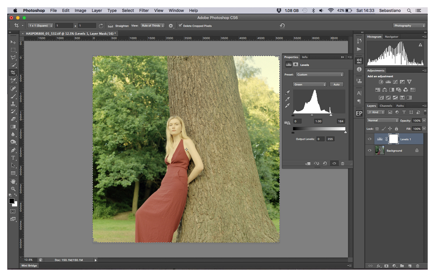
• The now positive inversion is muddy and needs correcting

• Before correcting crop the border, this is not absolutely necessary however if you want to keep a border then be aware of it in your histogram during the next steps.

• Create a new levels layer.

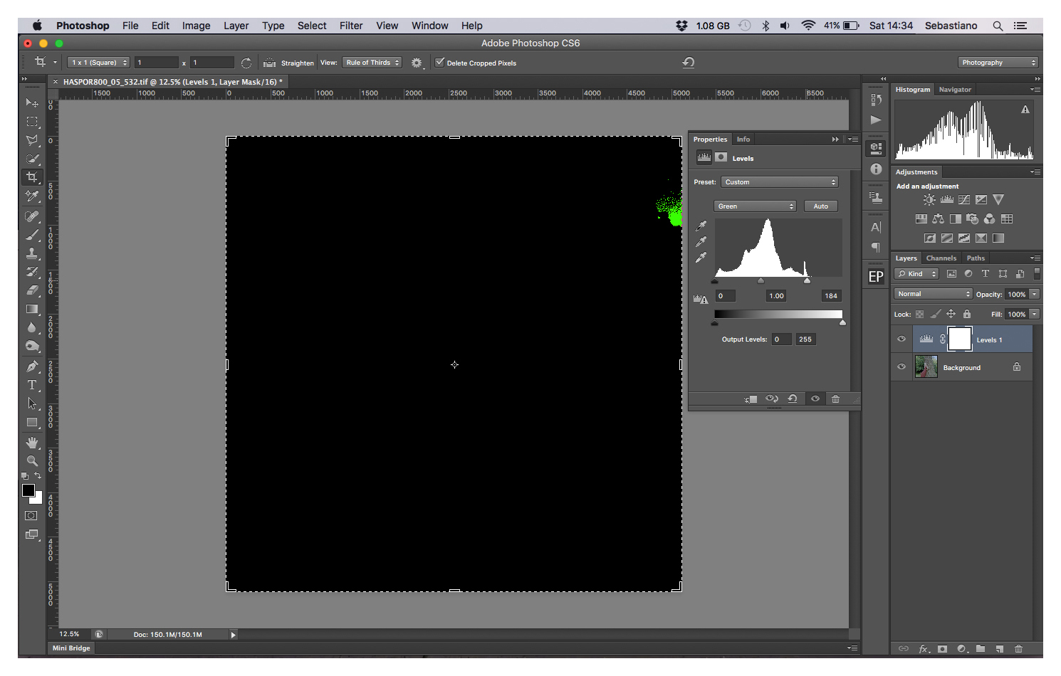
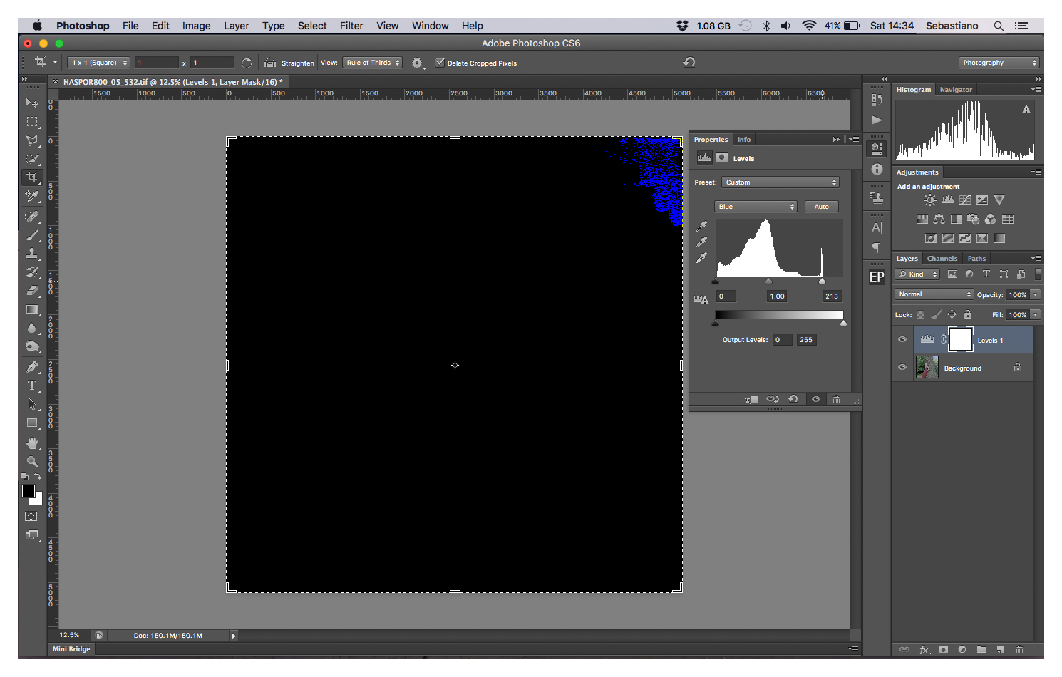
• In the dropdown box select the red channel.

• Start by pulling the small white triangle under the histogram box left so that it aligns with the right edge of the histogram above. If there is a space on the far left of the histogram pull the black triangle toward the right to align it with the left edge of the histogram above. 

• To help find the edge of the histogram hold the alt key until red clipping is seen. Repeat the process on green and blue channels.


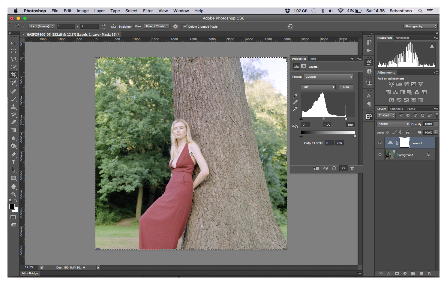
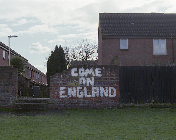
Initial inverted and colour corrected scan.

This is how I arrive at my starting point, a basic inverted scan ready to post process.  Dust and spot removal, sharpening and contrast controls are always necessary, often a mid grey correction and curve adjustment help finish the photo.  Obviously I don't for one moment suggest that what and how I scan is the best or only way, it's simply a refection of my experience as a film photographer. As such I'm always interested in other analogue photographers experiences and methods.  So please feel free to comment or discuss.

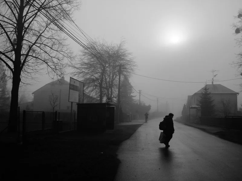
Finished photo, spotted, sharpened with final contrast and colour adjustments.

Photographed with Hasselblad 500c/m on Kodak Kodak Portra 800 film.

Model: Rosie Gregory


Sharing Space

And the allure of the double portrait.


Portraiture is predominantly the representation of a single individual and for as long as there has been art there has been portraiture.  Although the portrayal of a single person has the power to arrest the viewer and tell a story, without doubt, the traditional strength of an individual portrait is often amplified with a double portrait.  When a picture features two people there is an added dimension, a natural sense of story that emerges due to our own supposed views of the relationships between the subjects.  All of a sudden the connection is not just linear, from the subject via the camera and photographer to viewer.  In a double portrait, the relationships scatter in different directions.  It is these imagined relationships between the subjects whether they be lovers, enemies, friends, colleagues, siblings, family or even strangers that create for me, some of the most intriguing and fascinating portraits.  

For some time, I have been enjoying the work of Belarusian photographer Alexander Veledzimovich who truly exemplifies the strength of the double portrait.  His portraits regularly feature two people, they are exemplary visions of sharing space and so I recently asked him some questions about his work and influences.  

• Alexander firstly a bit about you? 

I live in Vitebsk, a town in the north of Belarus. People know of Vitebsk through the artist Marc Chagall who was born there and who then in Paris created pictures inspired by his childhood and youth in Vitebsk. I am 32 years old. I was a teacher for some time in a college but by chance became a photographer and I have been freelancing for over 10 years now.  At the moment I am in Warsaw, previously in 2010 I lived for 6 months in St. Petersburg and in 2014, I travelled around Europe for 5 months. 

• How and when did you discover photography?

An artist friend of mine had a Zenith with a 135mm lens and I liked how it all looked. I worked in America when I was a student and on the advice of my boss in 2004, I bought a Canon 300D. Probably in the second year I looked into the basics [of photography] and took pictures of concerts, friends, exhibitions, parts of an old town and even tried to make an improvised studio.  This all had little to do with the art of photography but it seemed that I had something.  Everything became more interesting after meeting Egor Voinov.   He told me to try and work with film and medium format cameras.  My photos gradually became different. Photography became a time for reflection, with the camera on a tripod and a cable release attached there came a degree of calm and concentration.

• Who are your photographic influences?

Ah, that’s a difficult question.  I like the honesty of the portraits of Oleg Videnin but at the same time I like the complexity of form of Evgeny Mokhorev.  I look for a harmonious combination of form and content, above all an ideal balance between one and the other.  For me, a good photo has visual beauty as I do not like abstract forms in which there is no meaning.  I also like the stories of Alec Soth and Cristina de Middel, they show the delicate line between reality and non reality in such an excellent way. 

• Why Portraiture, what does it mean to you?

Portraiture for me is a quiet world or place in which one can relax from premeditated photography.  I like the fact that I do not need to think about a subject and simply wait for when a person gives me the image.  In fact, after living in Warsaw for 6 months, I am realising that I needed to be in Vitebsk because, for me, it is important to near the people I know in order to create new portraits.

• You work feels like a mixture of simple honesty and constructed vision with your use of subtle props such as guns, skulls and masks.  Can you tell me a little of how and why you make these portraits?

Usually, everything in a portrait stems from that person being photographed.  I do not like to photograph in a studio and I do not like to specifically pre arrange reconnaissance visits.  I like to visit my subjects in their home and wait and see what comes of it.  In this way, I can make an honest and powerful photo, one which I can love even after many years.  Put simply, there is a person, there is me, there is a camera and random things around.  Of course, I select the things I like but everything depends on what the person understands, whether he holds a toy pistol or wears a mask.  My best photos are lucky improvisations

• Many of your photographs feature two people what is your interest in these double portraits?

Actually, a double portrait immediately creates a story; the observer looks at the photo in a different reality and tries to interpret the interrelation between the people.  In a single portrait, there is a stronger relation between the observer and the subject but it is more difficult to create a theme or story.

There is no doubt for me, that Alexander's unique and particular approach offers the viewer a memorable take on portraiture.  You can see more of his excellent work on his website here.

© All Rights Reserved | Alexander Veledzimovich 2016

Perfect Colour

If you've read any of my previous blog posts you may have guessed by now that I see scanning as the dark art of the hybrid analogue/digital workflow. Using a standard Epson V500 I’ve been scanning my negatives for almost four years and frustratingly still have not achieved enlightenment.  In February I finally purchased CF Systems ColorPerfect plug-in. Until now I felt that although inconsistent the results from the V500's bundled EpsonScan software were acceptable and the use of additional software would not be worth the disruption in workflow.  EpsonScan generally does a good job of converting scans, automatically applying black, grey and white points, but it can also be hit and miss.  Disconcertingly on occasion, I've even found that two shots taken in the same light directly one after the other could look very different in preview.  It’s not the scanner, it's the software.  The automatic initial adjustments applied are exactly that, automatic and adjustments.  If these adjustments are there or thereabouts, then making small modifications is straightforward enough.  However getting control of these adjustments within the EpsonScans interface for anything more profound is not easy and so inevitably is done in Photoshop.  In reality using Photoshop to correct EpsonScans limitations.  So eventually tiring with EpsonScans variable results I thought why not try another way?  

It is not my intention that this is a review of ColorPerfect, for me it's too early for that but I have found the process of making RAW or Linear scans of negatives to be beneficial. By scanning negatives with no adjustments seemingly all information on the negative is captured.  I now think of scanning as a three-stage process. Scanning which is just that, scanning the negative as a negative, no adjustments, no sharpening, no dust removal. The next stage is conversion from negative to positive and the removal of the orange mask.  Finally, colour correction, finding mid grey, contrast, highlight, mid-tone and darks adjustment.  In a conventional workflow scanner software such as EpsonScan or VueScan work to produce a final colour corrected scan in-line with all stages happening together in one process or it can be broken down and done separately, as I now currently prefer.

I hoped ColorPerfect with its vast library of film emulsions would somehow magically convert negative scans to positives while retaining the basic colour characteristics of each film type. The truth is as I see it, that ColorPerfect is a database of orange masks used to convert negative to positive. Thereafter its features are much the same as any other colour correcting software and in common with EpsonScan getting control of these adjustments is no easy process in ColorPerfect either.  ColorPerfect has some excellent colour correction features but they are hidden behind a difficult user interface that is neither intuitive nor graceful.  It does, however, convert an unadulterated negative scan to positive.  A scan that includes all information, effectively removing the orange masks and thereafter ready to go to Photoshop for the all-important final process of colour correction.  

I have no doubt that Adobes post-processing either in Photoshop or Lightroom is more powerful, more adjustable and more user friendly than anything scanning software can offer and in this workflow there is no need to correct their limitations either. The conclusion? Well as yet for me, there isn’t one, only progress because colour scanning still remains a dark art. 

1975 BMW 3.0 CSi | Hasselblad 500c/m | Kodak Ektar 100

Controlling Film Curl

001_sa.jpg

Something that has bugged me ever since I started scanning has been curly film. For 20 years I worked in the lithographic print industry and remember well the drum scanning machines and the lengths the operators went to mount transparencies on the drum. Air cans, squirrel hair brushes, wet mounting in oil to avoid Newton Rings and optically clear film overlays to secure the transparencies completely flat around the drum. All a far cry from the plastic film holders with their flimsy frame clamps that are supplied with most flatbed scanners. 

While scanning all too often I've dropped in a strip of film, clamped it down only to see the film bellying out. Thoughts of wet drum scanning nagging in the back of my mind. My solution until now has been to weigh down the film. After developing and drying, my best option was days underweight to try and achieve a degree of acceptable flatness. 120 film is flatter but not always great. 35mm; especially black and white can be terrible, the plastic clamps doing little or nothing to help.

After speaking to my friend Nicola Neri, a Milan based portrait photographer, whose beautiful film portraits often feature film borders. Borders are an indication that he is doing something different, his recommendation was to purchase a sheet of anti-reflective glass and to simply lay the negative direct on the scanner bed and place the glass sheet on top. My initial experiment was to purchase a sheet of 30 x 20cm etched defused anti-glare glass from a local picture framing shop.


Etched defused anti-glare glass is slightly frosted on one side, It’s the type of glass that was used before the clear modern anti-reflective coated glasses in use today. By placing the negative emulsion side down on the scanner bed and then placing the frosted surface of the etched glass on the non-emulsion side, unsightly Newton Rings were avoided. 

Unsightly Newton Rings are avoided by placing the etched surface of glass against the non-emulsion side of the negative.

However, there are three disadvantages to this: theoretically the film should be just above the glass for perfect scanning focus; not directly on it.  Only one scan can be made at the time, each frame needing to be masked and scanned before moving on to the next. Finally, the scan is back to front.

The third point is no big deal it is easy to flip the image in post-processing. The first and second are, and so to achieve the correct height and position the use of the scanner frames was necessary. Removing the clamp on the 120 frame was easy, a slight twist and out it popped. The next step was to have strips of etched glass cut to fit the channels of the film frame. On my 35mm frame, it was necessary to cut away some small lugs of plastic that held the 35mm strip in place at the leading edge, this was required in order to get a clear channel for the negative and glass to sit in. With clamps removed the negative can be placed in their original position but clamped down by the weight of the glass. The glass now completely flattens the film and the frame holder keeps it at the ideal height and in position so that the software can make multiple scans. The total cost of the cut and polished glass was £12.00 (approximately €15.00/$17.00) and for me, a cost-effective solution to control film curl.

Scanner featured is a Epson v500, glass is Matobel etched defused anti-glare glass.

OnFilm Photo

I was really pleased to be featured on the community work page of todays OnFilm Photo website. This is a great new site that amongst other things showcases the work of talented film photographers together with a short interview. In addition, there is a swap centre where people are swapping film from around the world and a flea market where you can buy and sell things! Worth checking out for sure.

Monday Morning Special

I was really pleased to have my photo Urban Vignette picked for the weekly feature 'Monday Morning Special' of Italian photography website ISO400.

It's a brilliant website that's dedicated to all things analogue. There is plenty of great film photography to look at along with insightful articles featuring many excellent photographers; well worth a visit at iso400.it

Hasselblad 500c/m | Fuji Pro 400H

Expired Experiments

The resilience of film was made evident to me in my friends darkroom last week. Just for fun and experimentation we decided to mix some old powdered chemicals in the form of a Nova Pro-Speed 41 Press Kit.

'How old is the kit ?' I said.   

'I last one I used was in 2003 and it was old then' he replied hopefully.

So who knows when the kit was actually past its sell by date but the deal was one film each to see what we got. Nova marketed Pro-speed 41 as a kit for professional press photographers. The kit came with full documentation for airport security and was sealed in zip lock labelled bags. I can imagine a press photographer in the 90's setting off to some far-flung place and processing their work in a grimy hotel room at the end of a days shooting. 


It would seem that one of the big advantages of the Nova kit was its flexibility of developing temperatures. The instructions recommended an optimum temperature of 38º but the enclosed printed table gave development times from 32º - 43º as well. For my part I choose to develop an expired Fujicolor Pro 160 film and so it was with some apprehension and relief when the negatives came off the spiral and I saw the film, it looked good with a decent orange base and strong negative images. But it wasn't util I scanned them that the true durability of analogue photography was made evident to me, in spite of using an old kit of chemicals and expired film I was still able to see some decent images, for colour if not content!

 Mamiya RZ67 with Fujicolor Pro 160NS developed in Nova Pro-Speed 41 Press Kit chemicals at 34º for 4:45 minutes.

Finding Mid Grey

Scanning colour negatives can be a challenge, the orange mask can seriously interfere with a scan and not all scans look or feel right straight off. Scanner software can do a good job of automatically balancing out the orange mask but the verity and differences these masks make can still leave colour casts. These, therefore, need to be manually removed and so a degree of colour correction is often required.  

After scanning this frame of Kodak Portra 800 with an Epson v500 at 2400dpi and saving as a TIFF file using Epson Scan software, the scan appeared to me too warm/yellow and not how I recall. Skin is a key colour in any portrait and can be used as a powerful colour control. For me, a good starting point for any colour correction is to find mid grey and these are the steps that I use to do it with Photoshop CS6.

• Start by adding a new layer above the background layer.

• Next fill this new empty layer with 50% grey by selecting Edit>Fill. In the pop out window use the dropdown menu to select 50% Grey.

• The new layer will now fill 50% grey. From the blend mode dropdown menu set the grey layer to Difference. Difference blend mode works by comparing 50% grey with the image below it and by looking for differences between them. Areas in the layer which are different from the picture below it show up as in unnatural yellows, purples and blues, but any areas which are the same between the layers show up as black. In other words, by using Difference blend mode, the areas which are not different become the darkest parts of the image, and can be used to locate any areas that closest to mid grey.

• Finding the mid grey areas is now as easy as finding the darkest part of the Difference layer. To do this add a new Threshold adjustment layer. With the Threshold window open move the arrow under the histogram to the far left i.e from 128 to 1 the image will go from black to white.

• Now by slowly moving the arrow back to the right gradually small areas of black pixels will appear on the white background. These areas are the areas of the image closest to mid grey.

• Select the colour sample tool from the eyedropper fly out tool panel and by zooming in close to the black pixel areas use the colour sample tool target a black pixel zone. 

• Next add a Levels adjustment layer and toggle off the Threshold and Difference layers by clicking on the eyes to their left. The colour sample tool target will still be visible and this is the exact area should be targeted by the set grey point eyedropper from the layers window.

• With the set grey point eyedropper selected, click directly on the target. All colours will now be neutralised based on this mid grey pixel, effectively colour correcting the image. It is further possible by using the opacity slider to get additional fine colour control. 

• Finally clear the target and delete the Difference and Threshold layers.


Vogue Italia

How cool to have this pair of photos chosen by the picture editors of PhotoVogue, the daily photographic showcase for Vogue Italia. I guess it makes Elizabeth's endurance of a freezing cold floor and my clambering about high above it worthwhile!

All photographed with Hasselblad 500c/m on Fuji Neopan 400 film.

Silverline Lane

Hushed Voices

My photo Hushed Voices features on the Dutch website Silverline Lane's November selection. Silverline Lane is a website dedicated to film photographers and is a publication of the Unlimited Grain gallery in Rotterdam who specialise in fine art photography. After an enjoyable browse on both sites, I can see there's some very beautiful and impressive work, and so it feels really good to be in such impressive company. 

I took Hushed Voices in Tate Britain with my 35mm CONTAX S2 and Zeiss 28mm Distagon T* ƒ2.8. There was just about enough light to shoot at 1/30 on Adox Silvermax 100 film.

Hunting the Everyday

It has been almost 40 years since the term “New Topographics" was coined by William Jenkins, when in 1975 he curated a show of American landscape photography held in Rochester, New York. The show consisted of over 150 black and white prints of streets, warehouses, city centres, industrial sites and suburban houses. Taken together their aesthetic was one of banal ordinariness. At the time the reaction was generally unfavourable however over time the influence of the movement, has been pervasive. Almost as a counterbalance to traditional unspoilt landscape photography these ‘man altered landscapes’ with their roads, trucks, industrial zones and empty cities have found increasing favour amongst photographers.

I have a propensity for this type of photography myself and follow many photographers who propose this style of photography amongst which is Pavel Petros a photographer living and working in the Czech Republic. I have always been struck by his approach and strong sense of locality with its simple translation of light and place, so I recently asked him some questions about his photography and influences.


• Pavel how did you discover photography?

It attracted me ever since I remember but in a serious and consistent way I started in 1999, when I was at the university. That’s when I got my first film SLR. It has however turned much more intensive in last couple of years.

• It is clear that you are inspired by New Topographics but how did you discover this distinct style of photography?

Yes, New Topographics is a direction of photography that charmed me. I first encountered it in Flickr groups devoted to this genre.  I loved all the photos showing a landscape in a different way - as a landscape that was touched by a human activity.  Soon it became the vast source of my photographic inspiration. 

• Which photographers works inspire and influence you?

There are many names. For example Stephen Shore representing the New Topographic movement and contemporary photographers like Alexnder Gronsky known for his photographs of Russian landscapes. But also from closer to home Czech photographers, Jindrich Streit, Viktor Kolar and Vladimir Birgus all brilliant documentary photographers.

• Your work has a strong sense of locality to it, it’s as if you work in an area very well known to you, can you tell me more about your locations and how you choose them?

I live in the north eastern part of the Czech Republic, close to the border of Poland and Slovakia. In this industrial part of the country I have a full time job where I commute from my village to the city. This journey determines the locations where I take pictures, however I don’t choose locations, I choose subjects. Hypothetically, If I was in Paris, I would photograph a recycling facility or abandoned houses on the periphery rather than the Eiffel tower. This quite well describes my attitude.

• Light and weather plays an important role in your work do you often revisit the same places time and again?

Sure, light is essential for any resulting photo. I mean, if I see a super awesome object but the light is not good, I would skip shooting it as the photo wouldn't be any good either. But it works also other way round: often boring subjects and places can result in an extraordinary picture with the right light. For me, photography is an exciting hunt of boring, common, everyday and ugly stuff captured in favourable light.

• Can you tell me a bit about how you approach a shot, what attracts you to a scene and how you work a particular place?

I think most challenging part is finding a subject. I explore the streets, backyards, generally, areas in the periphery. When I find a subject, the easy part of the job comes up – composing and pressing the shutter. I would take three or more shots of one subject just to make sure I have that particular image in the box. Then I move on.

• I noticed that you shot some photos in southern France recently, was it an easy transition for you to anchor your style in this new environment?

I had a wonderful time while on holiday in France taking pictures. I quickly adopted strong mediterranean light as ‘my light’. We stayed in Nice in the middle of the summer touristic season. I took advantage of it and photographed people more often than I normally do. Among all the tourists with cameras I felt invisible and free to capture people without being noticed. If I were noticed I was just another tourist without knowledge of local language. If I had more time I would have explored the periphery of the city and the countryside outside of the city.

• So if you had two weeks to spend anywhere in the world (to shot of course) where would you go?

But two weeks is too short a time to get under the surface of the place! If you asked me what to do with two or six months, I would say any place I haven’t been to before. I’m sure I would find exciting stuff to capture anywhere. It doesn't matter whether it is a little village in Siberia, the streets of the Bronx or old slaughter house in Bulgaria, it depends on the light and the subject itself.

• What role does post processing play in your work?

I like to keep things simple. I try to capture the photo right out of the box. I reduce post processing to very little fixes like strengthening or sharpening. Of course, if it is black and white a conversion is needed since I shoot digital.

• Do you have a project for 2015?

I don’t know if I will get to it this year, but I would like to publish a book of monochrome photos.

For me, Pavel's work is, the more I look at it superbly constructed and considered and far from simply images of the mundane and boring. His ability to apply his own understanding of composition, light and structure transforms these scenes of the everyday. You can see and read more about Pavel's work in his first book Silent Encounters and I certainly hope he produces another monochrome book to accompany it soon.

© All Rights Reserved | Pavel Petros 2014

CONTAX 645 | A personal re-view

1999 and in a departure for Contax the company made what could arguably be described as the worlds most advanced medium format film camera system. Together with its range of excellent Carl Zeiss autofocus lenses, interchangeable vacuum film backs and superb build quality it quickly became a popular camera of choice for professional photographers. The Contax 645 was always a high-end professional system but when Kyocera pulled the plug on the Contax brand in 2005, a legend was born. This together with the remorseless advance of digital technology meant that slowly more and more top end film cameras became accessible to analogue photographers. The Contax 645 has now become a much-desired camera for many film users. Not long ago my friend Viola Tavazzani told me about her successful hunt to find a 645, I thought it would be a good chance to get a personal view of buying, owning and using this noted camera.

• Viola what made you decide to buy a Contax 645?

I'm a wedding photographer, and when I became interested in Film Photography I thought it would be great to become a hybrid shooter, and thought I would need a film camera with a built-in light meter and autofocus. I started doing some research and found that one of my favourite wedding photographers, Jose Villa, was doing magic with his Contax 645. I loved the colours and the bokeh was just unreal. I needed that camera!

• How and where did you find your camera?

It was a long and difficult process. Here in Italy the Contax 645 is very hard to find: it was never very common because of it's high price, so I feared that all I could find was some tired and over-used ones from old photographers. Ebay was literally full of Contax 645 bodies coming from Japan or US, but I resisted the temptation to buy one online from overseas because I wanted to verify its conditions and integrity. Then one day I found an advertisement: there was a seller in Milan, about one hour drive from where I live. I went to the shop, and the camera was still in its box, with all the seals. I coudn't believe how lucky I was!

• Do you have any advice for a potential buyer of a 645?

Yes. Especially if you are in Europe, you need to be patient. Finding a Contax 645 can take longer than you expect. Then, don't just buy this camera because you want a great film camera with autofocus. It surely is not its best feature, especially if you love shooting at low aperture speed, because focus almost always needs to be manually corrected.

• What was your initial Impression of the system, and how does it compare to other medium format cameras you have used in terms of function and build quality?

The only medium format cameras I used before the Contax are the Yashica 645 and the Pentacon Six TL. Of course with the Contax you get the instant feeling of a newer, less "vintage" kind of camera. Despite its heavy weight, it's not bulky and the grip makes everything easy to handle. Also the loading system with the film insert is trouble free, and the auto-rewind once the roll is finished is another great feature.

• For me, the subject definition and soft backgrounds that the Contax 645 can make are two of its best features, what are its killer photographic characteristics for you?

The ones you mentioned are easily my favourite features of the Contax. Thanks to the Zeiss lens you can have your subject almost detached from the background, and that is what I like the most. Plus, the 6x4.5 format is such a great size because you have more space in comparison than the usual 6x6 medium format frame. Of course you need to pay even more attention to the composition, but that is what makes this camera the best choice for shooting film at weddings.

• Tell me about your first shoot with the camera.

I was very worried before shooting my first roll. I had just bought the camera and I feared something could be wrong with it. The day after I bought it I jumped on the train to Rome to shoot the first roll with my boyfriend. He is a film shooter, too, and he was as excited as me for my new toy. We shot an entire Kodak Tri-X 400 at sunset in Villa Pamphili, and developed everything at home the next day. It turned out truly beautiful.

• Viola what's better, your Contax 645 or your Nikon D800?

Of course I need my D800 for weddings, also because in Italy film photography is still considered vintage and has almost no attraction for clients. I hope to be part of the change about that. If I have to say which one I liked more, I would say the Contax with no hesitation. I just love it!

• So you'll keep the 645 forever?

Yes, I'm starting a little film camera collection, and I always thought I could sell something in the future if I need to, but the Contax will stay exactly where it is.

Well, there's nothing like a personal recommendation to make me even more envious! There is plenty more evidence of how good this camera can be in the right hands on Violas website L & V Photography or you can follow her Flickr photostream  Scarletd here

© All Rights Reserved |Viola Tavazzani 2014

Notes from the Rust Belt

When photographer Markus Lehr moved to Berlin from southern Germany in 1982 he brought with him memories of his father's keen interest in photography. Remembering as a child his fathers Voigtländer Bessamatic together with its impressive collection of lenses and filters that he used to carry around in his old leather bag. Later as a teenager, Markus was allowed into the darkroom of his father's camera club and a whole new and exciting world was revealed. The baton was passed and although Markus shot regularly from then on, it was not until three years ago whilst trying out night photography that a true and meaningful fascination with photography emerged. 

Since then his photography has evolved, now specialising in urban images that reflect an unseen human presence and relationship with the city’s often forgotten and unused places. The topography and elements of his work by being ubiquitous and commonplace tell stories without necessarily setting them in a time and place. One of Markus’ most recent works ‘Notes from the Rust Belt’ features long exposure night work of the Ruhr’s industrial areas in western Germany, this project exemplifies his current work and gives us a chance to explore further his photographic thinking and influence.


• Markus your focus is very much on topographic landscapes, human involvement is ever-present but only implied, can you tell me a bit about your interest in this area and how it may have evolved from your photographic beginnings? I  guess what I’m interested in is how you came to develop this style.

I guess in the beginning it was quite logical that there were no people in my shots. I needed to concentrate, so I  intentionally selected calm places to explore the long exposures I was interested in. After a while I noticed the power of this "peoplelessness" and I began to realise that even without any humans  within the frame the scenes were still talking about us and the relationship we have with our environment. I began to focus on that further. Another source of inspiration was my love for arthouse movies. Especially Antonioni's Desserto Rosso and "Blow up" influenced me tremendously. This brings me directly to your next question.


• You seem to have a fascination with stillness and the dark, the majority of your work is photographed at night can you tell me why you chose to work during these hours? 

There is a scene in Antonioni's "Blow up" where the main character is situated outside an empty tennis court. We hear the sound of a ball being played but we see nothing than the empty field. Everything happens in the head of the main character. I think I would be happy if my images could achieve an effect like that. So much for the stillness. About the night: The simple answer is that I can concentrate and focus easier in the quiet places where I am shooting mostly. I guess it has a lot to do with wanting to control the result. The cinematic approach may also play a role.


• I notice that colour plays a key roll in your compositions, what is your feeling about colour and it’s roll in  your work and have you every worked in mono?

I love colour, the many fine tones and feelings  you can express with colours. I would miss those possibilities if I would restrict myself to black and white. Colours are also playing a big role in creating the atmosphere and feeling of a scene. For me it is more a whole thing, it adds the real life which is in between black and white. I don't mean the shouting colours, the more I explore this path the more I prefer the dimmed ones. Very close to grey or white or black but with a little tone. Maybe this is a continuation of my search for the quiet places. I did work in black and white earlier on and I was sometimes tempted to do night shots in black and white but then again, whenever It tried it I didn't find the results satisfying.


• Your latest series Notes from the Rust Belt is associated with the post industrial decay and economic loss in many Northeastern states of the US. Is this a term used in Gemany? 

The term isn't used in Germany but as the Ruhr area faced a very similar fate compared to those states in the US, I  thought it would be a good idea to set the tone for the series with this title.

• You are from Berlin, what is your association with the Ruhr in the far west. Notes from the Rust Belt with it’s big sky and expansive landscapes is set apart from some of the more intimate images of small huts, vehicles in your other work. Is this a conscientious thing or just a consequence of the locations?

As a young boy I was fascinated by stories about spacecrafts and friendly aliens coming to visit us. The Ruhr area is full of old industry of the last two centuries. Unlike Berlin you find a lot of those places relatively intact. Going there meant a bit visiting my childhood dreams. Now I am not that boy anymore and a lot of those childhood dreams didn't materialise and so while I was there the images I captured oscillated between that fantasies of the young boy and the melancholy of the grown-up person. The places are empty now. Nobody works there any longer. "Everybody moved to the new world" like I titled one of  my images. I don't see this as a loss only. It is a new beginning as well and you can feel it there a lot. I hope I succeeded saving that sense of wonders a bit.


• How long did it take to complete the series?

I was preparing the trip, finding out about the locations for a month roughly. The shooting time was four days and nights. And then it took me another month and a half to select and  process the images.

• Can you tell me about your plans for your next project?

I hope I will have the time to do a series about my home region, Franconia, later this year. This would be kind of a complimentary project to 'Notes from the Rust Belt'. It would be a rural area vs. a highly industrialised one and an area I have known since childhood vs. a place I have never been to before. I am planning to focus on the detached countryside aspect, the small villages and the earthy and dark green tones vs. the concrete and steel and iron tones of the Ruhr area. I have a few other ideas in mind like a series about workplaces. I occasionally shot images with this theme in mind already but never really focused on it. It is exciting going out and coming home with a bag full of images to explore. Sometimes the idea for a new series materialises while I am working on an image. So who knows what's around the next corner.


For me, every time I see one of Markus' images there is a beautiful stillness and contemplation in his compositions. Knowing more about his thoughts and how they are made only adds to their fascination. If you want to see more of Markus Lehr’s work you can follow his photostream f1dot8 on Flickr, or catch up with his latest news on his own website

© All Rights Reserved | Markus Lehr 2014


Maman, lève un peu plus la tête, regarde le plafond...

© All Rights Reserved | Dominique Conil 2014

“Mummy tilt your head back and look at the ceiling”.    

An instruction from Dominique's seven-year-old daughter Lili as she took charge of her mum's Bronica SQ.    

"I set the speed and aperture, Lili focused and framed"  

Dominique proudly told me.  

The resulting image is both revealing and enchanting.    A special portrait with it’s low down angle and requested pose, this picture sums up the magic of a child’s eye-view and was a chance for the tables to turn, allowing Lili to be the photographer and not the subject for once.    If you want to see some of Dominique’s own beautiful analogue work, visit her website www.dominiqueconil.fr